Henrik Vibskov is known internationally as the Danish fashion designer and multi-hyphenate who brings a touch of the weird and wonderful to everything he does. His latest project is the opening of his store in Copenhagen.
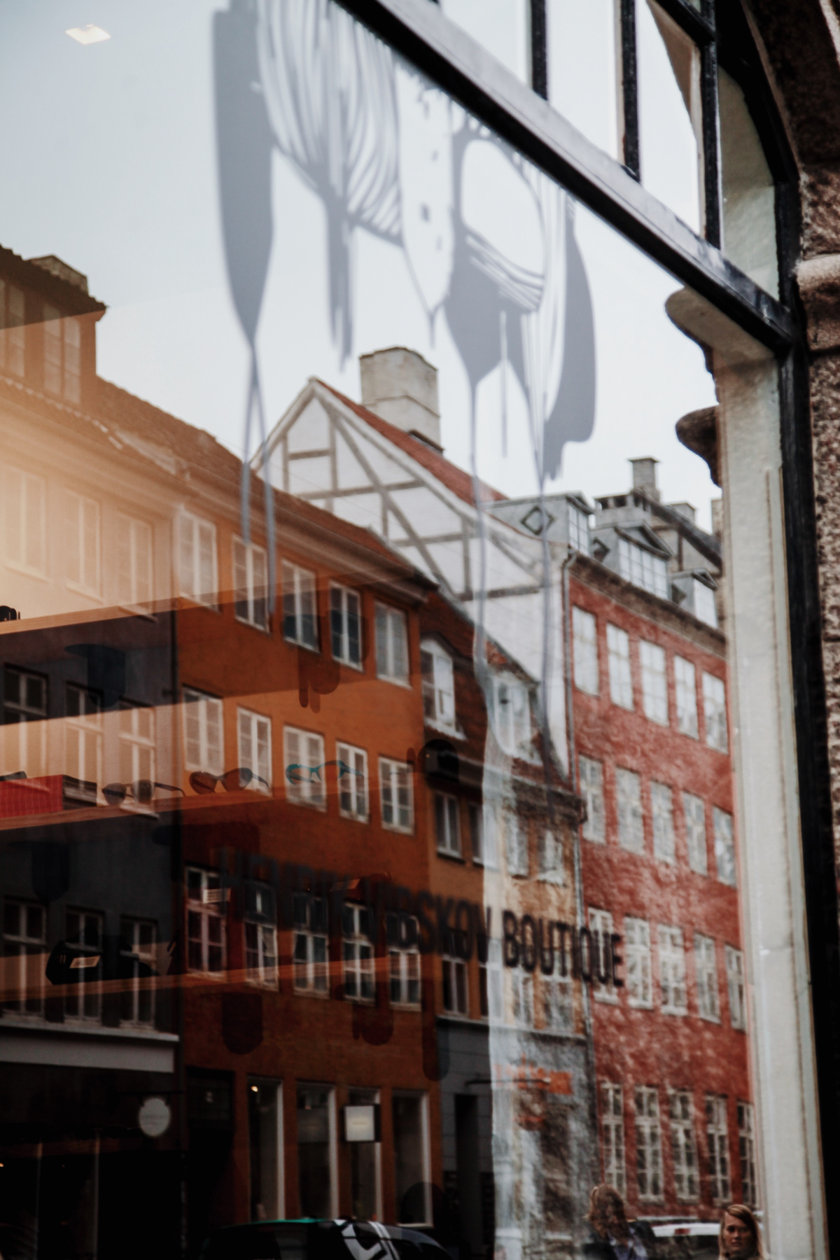
Previously located on Krystalgade, the new space is on Gammel Mønt, offering a larger but equally central location. “It was sad to say goodbye to that space,” says Henrik. “We were there for nearly 13 years! But it was time for something bigger, and this space was too good to pass up.”
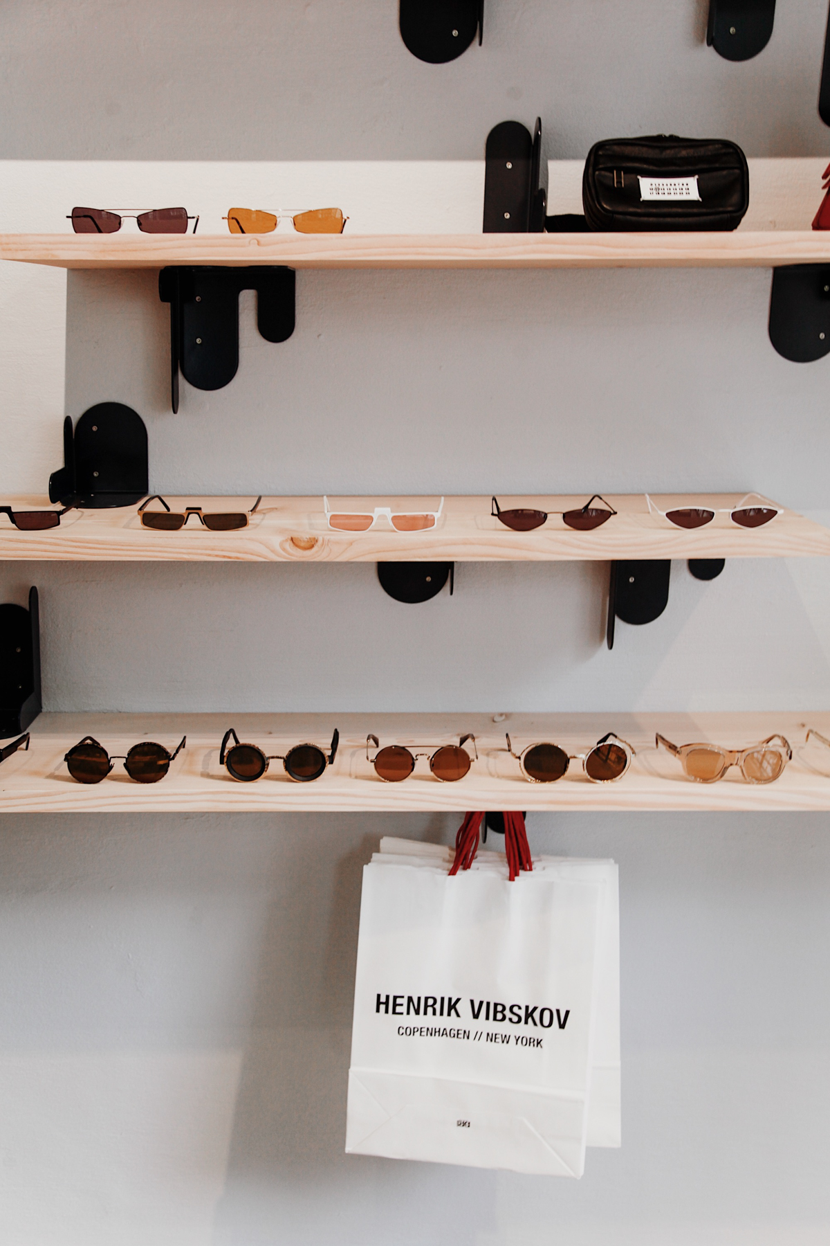
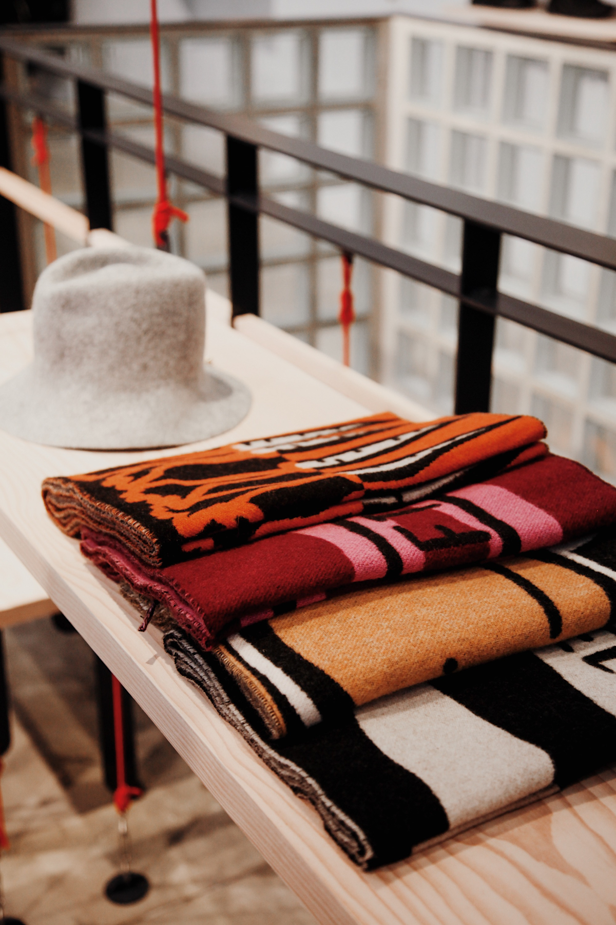
The space was designed by London and Copenhagen-based Clover Studio, in close collaboration with Vibskov. It features tables suspended by climbing ropes (knotted with a Triple Davy) and stuck to the floor via double sided tape – you know, the really, really strong kind.
 |
 |
 |
The September 2019 opening unveiled the interior for the first time, and: wow! It has feet firmly in both Copenhagen-style and the style of Henrik himself – something impossible to fake or duplicate.
“We actually originally designed this space for our smaller store, and then decided to move the concept over here,” Henrik explains. “So that was a big job. But the results are exactly what I wanted.” High praise from the man himself.

We spoke with British architect and designer Henry Clover of Clover Studio about creating Henrik Vibskov’s new shop in Copenhagen and what it’s like to work with someone as creative as Henrik:
What was Clover Studio’s role in the new Henrik Vibskov store?
My studio’s role was to work with Henrik to design a concept, display system, and interior for the store.
 |
Was this your first time working with Henrik Vibskov?
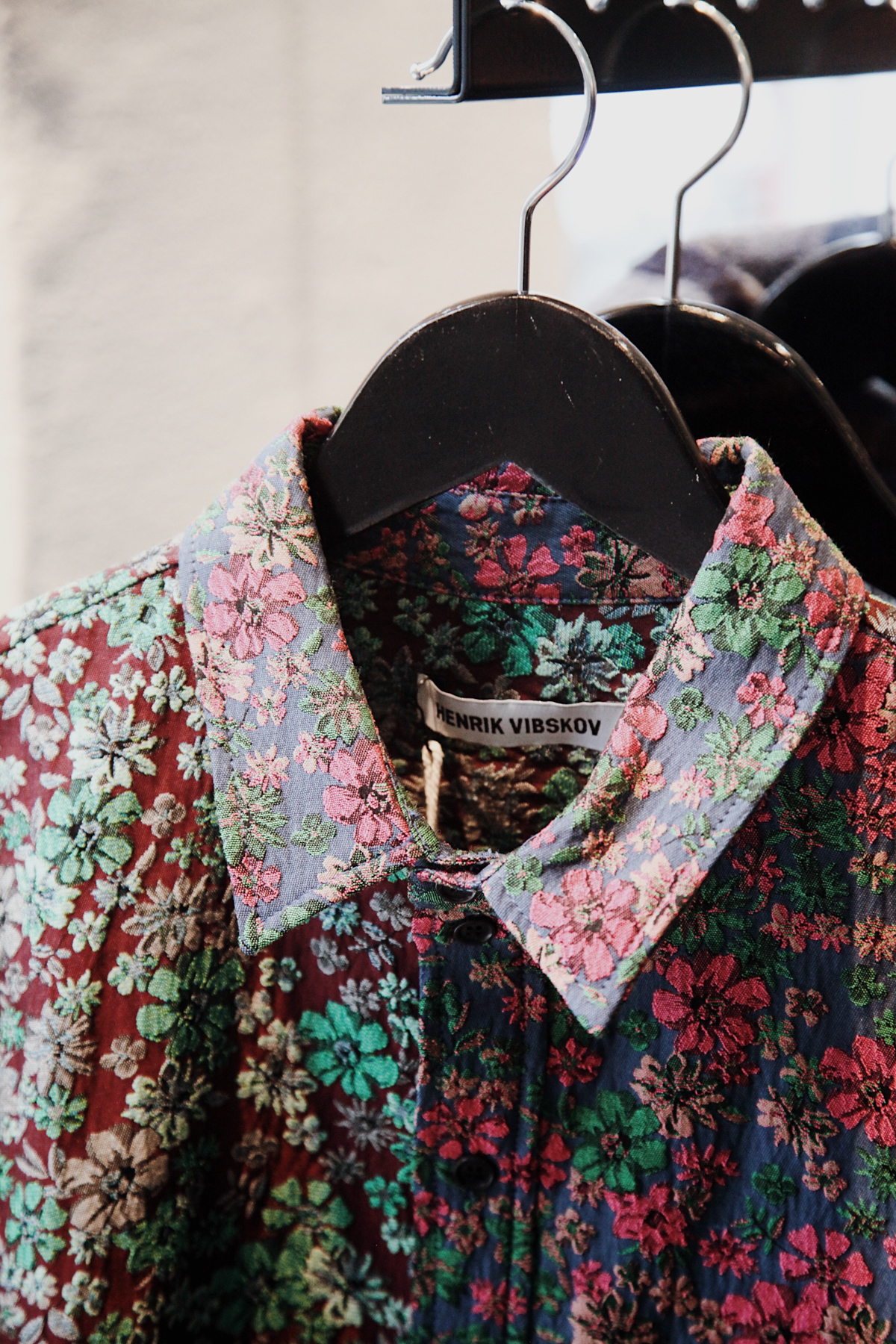
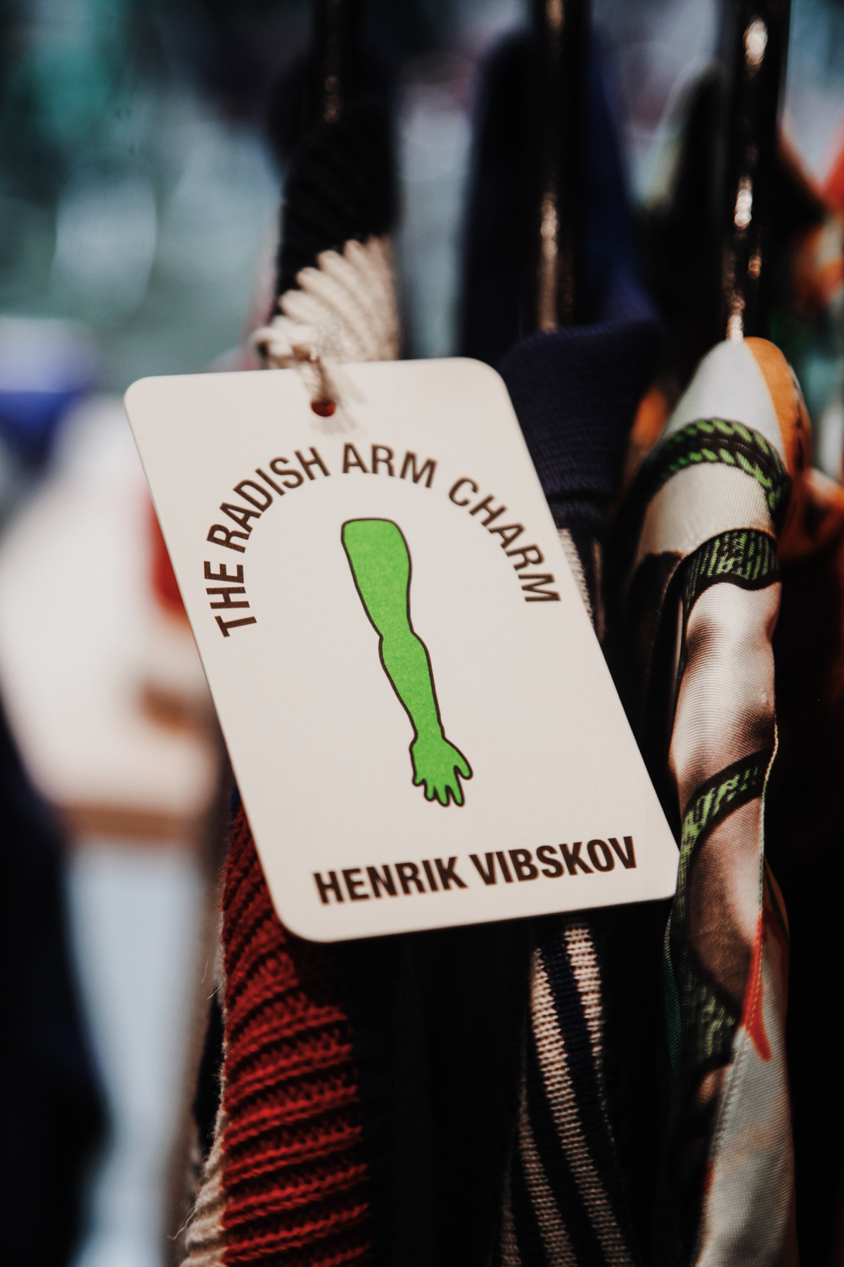
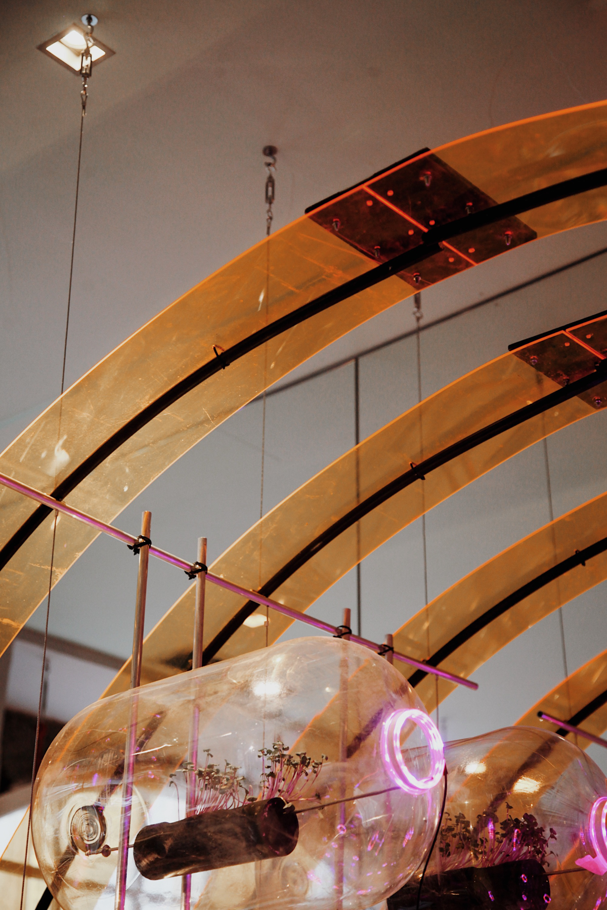
I have worked with Henrik, building his Radish Arm Charm installation for Paris Fashion Week in January 2018. My aim was to make the installation perform on as many levels as he wanted. It moved as people walked through it, lit up, was 20 meters long, had 180 plants in it, and had to be made and taken down in a day. It was a serious test, but a privilege to do and got us here.
 |
How would you describe the mood board or influences behind this space? Did Henrik come to you with anything specific as an influence?
Having worked with Henrik before, I was aware that the space needed an expressive language and a unique material combination. Henrik’s distinctive portfolio was the moodboard in a way, and I presented some playful language options that I thought were in line with his ideas.
The aim was to make the furniture the expressive party piece, and avoid putting an installation on the wall. We wanted to go with the Danish furniture theme while avoiding the usual nice-but-expensive Danish carpentry.
I proposed a stalactite/stalagmite cave-like environment, using custom metal brackets to hang furniture. Henrik quickly took interest in one sketch I did of a hanging rack, and I ran with it.
How long was the design process, from start to finish?
The design concept was quite quick to draw out and maybe a month or so to nail down. The detailed production drawings for 38 different metal parts, arranged on 21 unique furniture items, took four months.
 |
 |
 |
 |
How would you describe the space as it was before you began working on it? In other words, what were the bare bones of the space?
It was a fairly clinical white furniture showroom with lamps hanging everywhere. We cleaned it out, knocked down a partition wall and made it a lot bigger.
How would you describe the space now that it’s been made into the Henrik Vibskov store?
The aim was a playful, immersive space, offering just enough of crispness to satisfy the Danes, but also challenging Danish store norms.
 |
 |
 |
|
How much does typical “Scandinavian style” or “Danish style” come into a space like this? Was it important for you to pay homage to that in any way?
We worked closely with Dinesen. The aim was to use their very beautiful and monolithic Douglas fir planks, juxtaposed with the stalactite / stalagmite styled and folded metal parts.
This anchored it in the Danish sphere, while everything else went a bit surreal, in the way Henrik encourages.
What is important to remember when working with someone creative like Henrik?
To defer to his style.
 |
 |
 |
 |
Can you talk a bit about your practices when it comes to sustainability?
My part was to design everything so that there would be an absolute minimum of waste. This is what architects can do. Everything was made virtually in CAD and I meticulously laid everything out onto cutting lists of planks with the minimum of waste, changing the design if necessary.
Are there any key elements of the space you would like to point out, or that you are particularly proud of?
I will only be proud of it when I [know that] Henrik likes it. But I’m looking forward to the hanging tables.
 |
 |
 |
|
Find out more about Clover Studio on their website and Instagram.
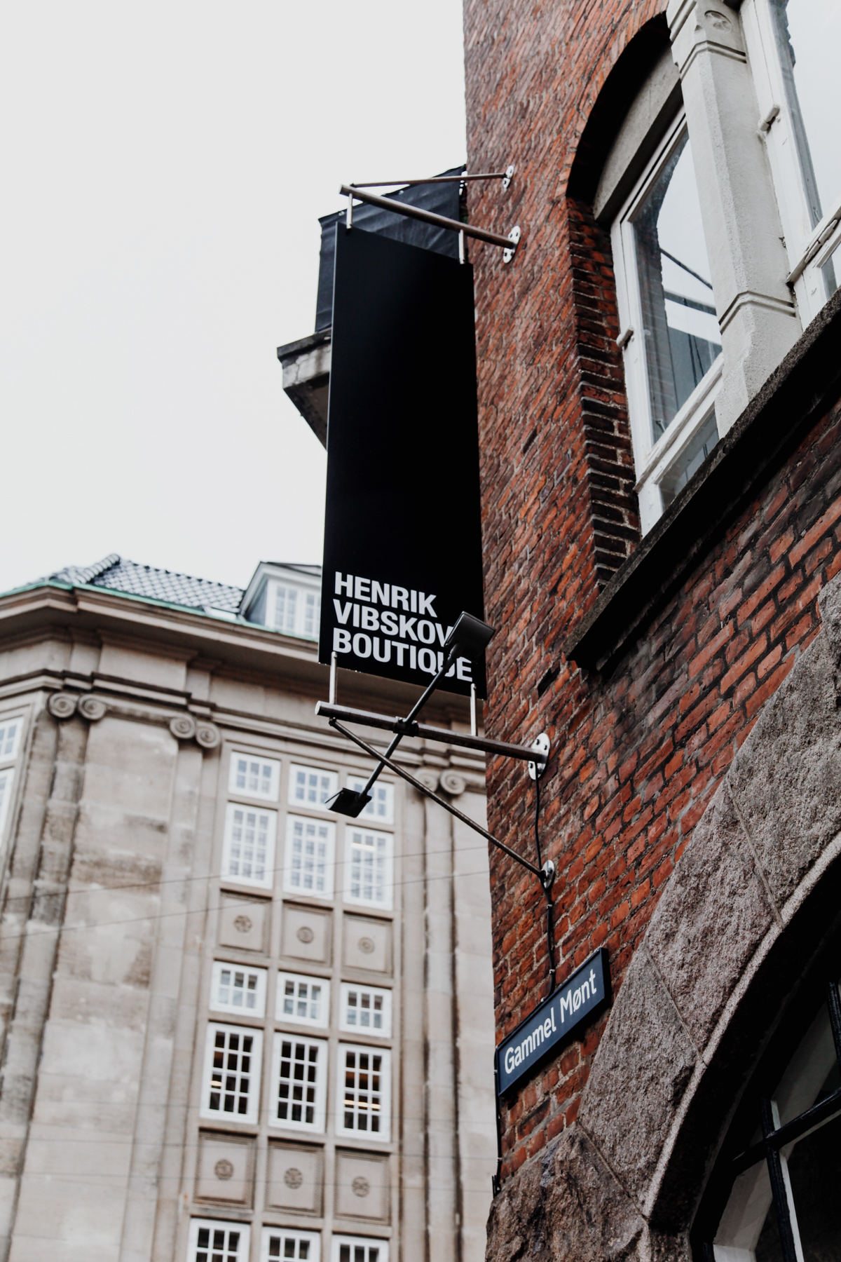
Henrik Vibskov Boutique
Gammel Mønt 14
1117 København K

