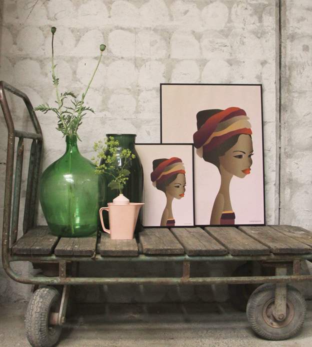
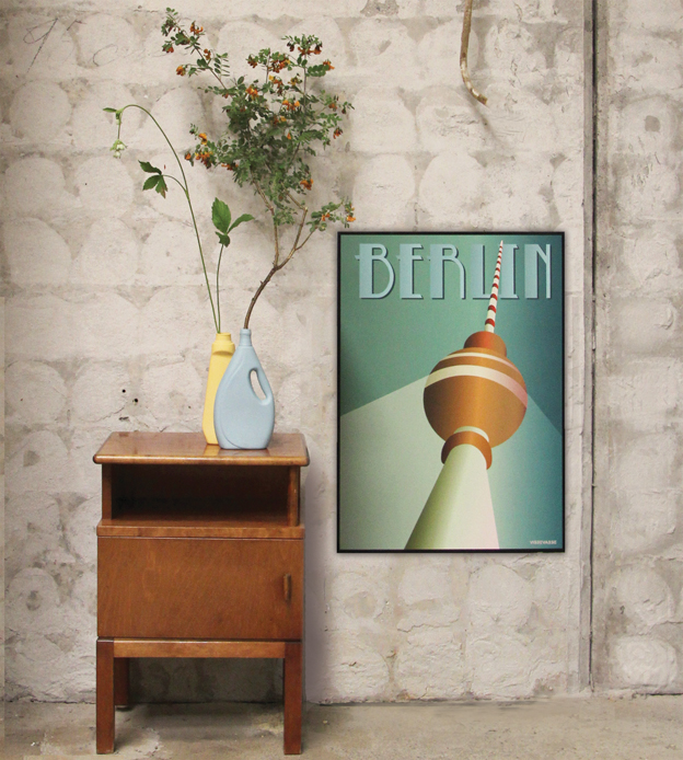
When I think of Danish design, I don’t usually equate it to the Art Deco period of the 1920s-’40s. There’s something too decadent about it; too rich. Those clean Scandinavian lines don’t quite match up. And yet, seeing iconic landmarks rendered with the thick strokes of Deco-style in graphics seems just right. It’s a contrast that somehow works perfectly in ViSSEVASSE posters.
Launched by former fashion and graphic designer Dorthe Mathiesen, ViSSEVASSE began in 2012 when Mathiesen decided to run a Christmas market with friend and fellow designer Gitte Christensen. While the two built up Loft Bazaaren, a design market on Amager, Dorthe thought about what kinds of items she would like to contribute to the market. She came up with ten Bauhaus posters. The posters sold well and, after the market ended, she continued making them, focusing on landmarks in cities that locals would recognize.
Looking for somewhere to sell, Dorthe contacted ArtRebels at the start of 2013. They agreed to carry her posters. As over the next months sales kept growing, she developed her own webshop. By that summer, retailers were contacting her to sell ViSSEVASSE. Mathiesen then began attending design fairs such as Formland, where sales and exposure grew.
It’s truly a start-up story, and one by which Dorthe seems completely humbled. While she still creates all the designs herself, she says she now has some help for things like accounting and packing that allow her to be creatively productive.
That productivity is going gangbusters; there are now between 50-60 designs in four sizes starting with a small postcard. The work now covers a host of cities around Scandinavia and the world. When I ask what her favorite poster is, Dorthe looks around her office, with posters dotting the walls.
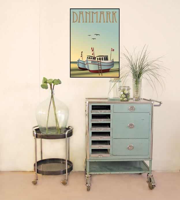
“It changes all the time, but at the moment I’m loving the ‘Norge’ poster. It reminds me of a trip I took with my family. It’s a great memory.”
That, Dorthe continues, is the real reason she loves making the posters. “I get notes from customers all the time explaining why they chose the posters they did, and that they have a personal story to go along with it. It’s almost always that there’s a memory attached; I love that! I’m so grateful people have my posters on their walls.”
Now working on expanding the collection to include botanical and culinary posters, ViSSEVASSE is spearheading a major graphics trend around the world. Because Dorthe is using such a classic look and combining it with with locally-appreciated icons, then posters are sure to remain popular with those who love their own cities, or love to make memories while traveling.
As we browse through her massive collection, I understand exactly what she’s been telling me. Looking at the Stockholm poster, I see flashes of a special 2011 trip with my husband and Scandinavia Standard’s upcoming launch. The New York City poster of the Chrysler Building brings back an 8th grade trip to that famous spot.
I pick up a poster depicting heart-shaped waffles with a simple recipe underneath. “I make waffles for myself and my husband every Sunday!” I say, smiling. “Well,” Dorthe says, “Wouldn’t you like to have that feeling every day?”
Now, I can’t wait to get that poster up in my kitchen.

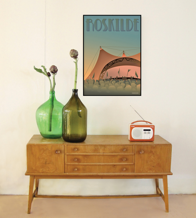
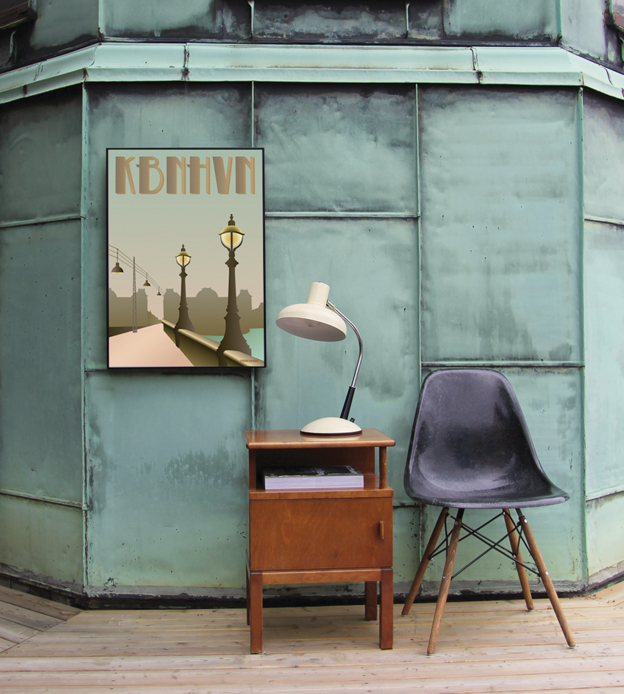
See more ViSSEVASSE on ArtRebels.
Follow ViSSEVASSE on Facebook & Instagram!

